Posts

Showing posts with the label publication

Project #11 - Magazine Mockup

Image
This was a mockup magazine that i created in photoshop, then orginized in adobe indesign. I made a magazine that was supposed to be a magazine about how technology and science can be incorporated in and inspired by nature. the fact is that despite technology and nature usually being viewed as two seperate fields, often times they are inspired by one another. an example of this is that the first ever flying machine designs were inspired by birds. these machines are called ornithopters and they fly by flapping their wings. although none of those have been successfully made, it's an example of how nature inspires us to keep on creating.

inspiring magazine designs

Image
ADS These ad designs really appeal to me, since they manage to get their message across really well, despite not using a human subject to demonstrate it as you often see, the layout is very minimalistic as well, which to me is appealing since it doesn't overcrowd the page with information. the simplistic photos also appeal since they are son minimal, but they tell so much about the product. the ebay ad shows its an online store by making a store window display into the screen of a phone as if the phone is the store, and the maybelline ad shows that it's makeup by having the brush and pallette in the picture, since the pallette is in the picture it also tells you what your getting, rather than showing what it's for, since we already know that. Spreads these magazine layouts really appeal to me due to their simplistic designs, and the use of negative space, the use of it makes you able to recognize what the article is talking about, and the addition of simp...

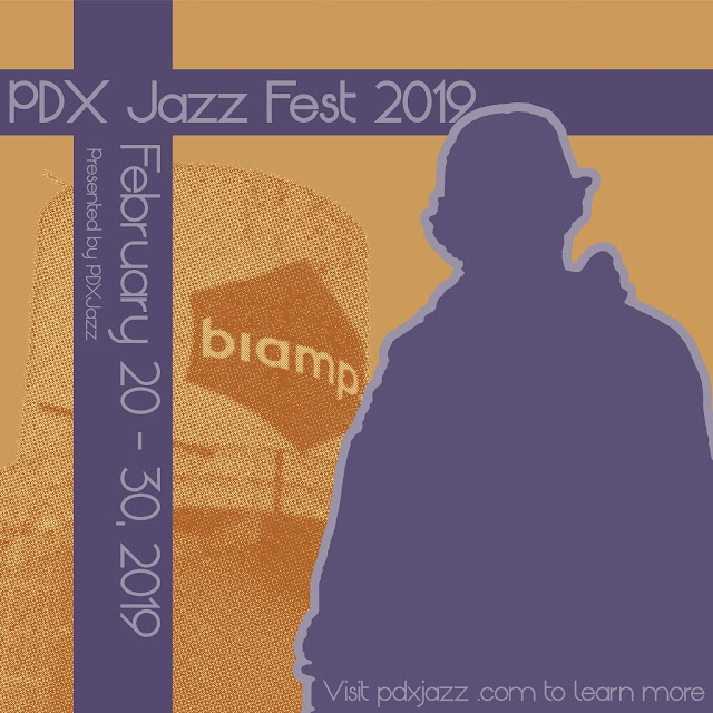
PDX Jazz festival 2019

Image
This cover was done in collaboration with Kodalev Daniel, he took the photos and i was tasked with using them in order to create a cover for the Portland Jazz festival. he wanted a colour pallette similar to the dave brubeck quartet - time out, so i used that to sample colours to use for my final project this one was done in collaboration with Mia Nelson, for this one i was able to use a colour duotone in order to make it look older, and the pallette was inspired by the 30s and 50s. i wanted to give it that old vintage look turned modern, so i used that old pallette, but the shapes and the rest was inspired more by current contemporary art.

LHS band quarter 2 concerts

Image
This poster was made for the quarter 2 band concerts, although this poster did not end up being used in the end, i am still really proud of it. this project taught me a lot about using text as a medium that can be used to show movement. Looking back on it i don't like the warp used on the dates, but the way i had used text warping to fit a shape i feel was really good, especially for my first time doing it. 

A time you were wrong

Image
This project was a struggle, I'm not afraid to say that, because I spent so much time on it. I poured my free time into it, and in the end it became my first published work. this piece was created to illustrate a poem called A Time You Were Wrong, for the book Bridging The Divide by outside in. Outside In is an agency that takes in orphaned children and provides them with the opportunity of education, and escaping their past lives if they want to.  their cause is honorable, and I encourage you to donate and support them if you can Outside In's Website

Winter Formal 2018

Image
This poster that i made was for the winter formal dance at LHS in portland oregon. I tried to avoid the cliche snowflakes in the poster, so instead i used cool colours and a pine tree to imply the winter theme.  edit: this ended up being the final draft of the poster, since they actually wanted a really cheesy poster. they wanted white gold and blue snowflakes, and instead of doing just one tone for each, i used slightly different tones for each snowflake so that it looked natural instead of Just copy and pasted.

She Kills Monsters

Image
This was a poster that I made for Lincoln High School's play She Kills Monsters Written by Qui Nguyen and Directed by Francisco Garcia. It's a play about a famous D&D player who died, and her sister has to go on a quest to get back her soul from the evil Tiamat. The main character Agnes is portrayed above the title box, and she is using magic to make a D20, and on either side of her is two heads of the five headed Tiamat. The heads were drawn by Kai Field, and Agnes was drawn by Maia Clark. and my teacher was Jerod Schmidt