Posts

Showing posts with the label graphic arts

Polluted Purity, collaboration with Kai Field

Image
This was the design i used for a screen print. It was my first time doing screen printing, and it provided many new challenges such as the limited colours allowed, as well as making so it didn't get ruined if the design wasn't aligned perfectly.  for the final product i printed on thick paper, which i believe was water color paper (my teacher didn't tell us) and we folded and ripped 12 sheets which we printed on, we did this in order to give the print a more handmade feel as opposed to cutting it which would look more machine made and less like it was actually printed by hand, which it was.  in total I made 12 prints with the help of Kai Field and we both signed them, and numbered them 1-12 with one being the most accurate to the original design, and 12 being the worst print. each step of the printing process was done by hand, we exposed the screens by using a UV lamp and a b/w transparency print of one of the colours (NOT gray scale, as you can not do gradients us...

Project #9 - Surrealism and Photomontage

Image
These are two photos that I had made for my photography class. for this project we aimed to recreate a surreal style of art. these photos show surrealism, since they show situations that can not exist in real life. The first photo actually glitched in the middle of making it, i liked the way it looked so i screen shotted it and overlayed it over the image that i had been working on. i also mirrored the image up and added a filter to it to make the sky look weird and impossible. The second photo I was experimenting with what I could do in order to make the sky look weird, so I cropped out the sky, and replaced it with an image which i then used a ton of filters on in order to make it look as  trippy and weird as possible. after that i thought that i needed to add something that would make people question it in some other way, so I added a giant hand, there's not much more to it than tha

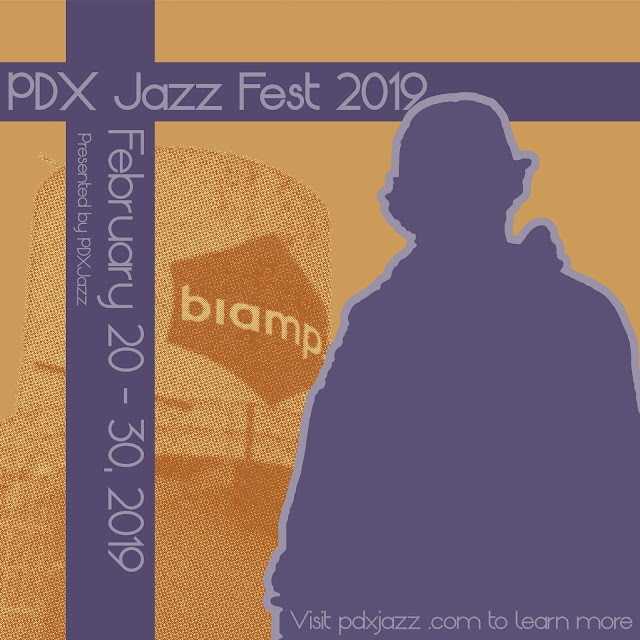
PDX Jazz festival 2019

Image
This cover was done in collaboration with Kodalev Daniel, he took the photos and i was tasked with using them in order to create a cover for the Portland Jazz festival. he wanted a colour pallette similar to the dave brubeck quartet - time out, so i used that to sample colours to use for my final project this one was done in collaboration with Mia Nelson, for this one i was able to use a colour duotone in order to make it look older, and the pallette was inspired by the 30s and 50s. i wanted to give it that old vintage look turned modern, so i used that old pallette, but the shapes and the rest was inspired more by current contemporary art.

LHS band quarter 2 concerts

Image
This poster was made for the quarter 2 band concerts, although this poster did not end up being used in the end, i am still really proud of it. this project taught me a lot about using text as a medium that can be used to show movement. Looking back on it i don't like the warp used on the dates, but the way i had used text warping to fit a shape i feel was really good, especially for my first time doing it. 

A time you were wrong

Image
This project was a struggle, I'm not afraid to say that, because I spent so much time on it. I poured my free time into it, and in the end it became my first published work. this piece was created to illustrate a poem called A Time You Were Wrong, for the book Bridging The Divide by outside in. Outside In is an agency that takes in orphaned children and provides them with the opportunity of education, and escaping their past lives if they want to.  their cause is honorable, and I encourage you to donate and support them if you can Outside In's Website

Map of Midab Mora

Image
This is a map that i had made last year of a fictional world that me and my friend had created. this world is full of orcs, cat people, and elves. each island has several provinces that have their own story and culture. This was the first time i tackled something so large, and it turned out amazing.

Colours of Unity

Image
Colours of unity by Cally Cruikshank shades of violet are used to create a sense of unity in the viewer by unifying every aspect of the design. the colours were chosen specifically to invoke peace and fear into the viewer. everything is evenly spaced and symmetrical to add a balanced yet weighted feel. portraying life's necessary balance of stress and achievement.

Winter Formal 2018

Image
This poster that i made was for the winter formal dance at LHS in portland oregon. I tried to avoid the cliche snowflakes in the poster, so instead i used cool colours and a pine tree to imply the winter theme.  edit: this ended up being the final draft of the poster, since they actually wanted a really cheesy poster. they wanted white gold and blue snowflakes, and instead of doing just one tone for each, i used slightly different tones for each snowflake so that it looked natural instead of Just copy and pasted.

She Kills Monsters

Image
This was a poster that I made for Lincoln High School's play She Kills Monsters Written by Qui Nguyen and Directed by Francisco Garcia. It's a play about a famous D&D player who died, and her sister has to go on a quest to get back her soul from the evil Tiamat. The main character Agnes is portrayed above the title box, and she is using magic to make a D20, and on either side of her is two heads of the five headed Tiamat. The heads were drawn by Kai Field, and Agnes was drawn by Maia Clark. and my teacher was Jerod Schmidt

Island above the sky

Image
Here's a small little icon that I made using Adobe Illustrator. it's a vector drawing of some mountains and hills. i used only three colors, and in the final product i applied a drop shadow to each piece in order to give it a sense of depth