Posts
Polluted Purity, collaboration with Kai Field

This was the design i used for a screen print. It was my first time doing screen printing, and it provided many new challenges such as the limited colours allowed, as well as making so it didn't get ruined if the design wasn't aligned perfectly. for the final product i printed on thick paper, which i believe was water color paper (my teacher didn't tell us) and we folded and ripped 12 sheets which we printed on, we did this in order to give the print a more handmade feel as opposed to cutting it which would look more machine made and less like it was actually printed by hand, which it was. in total I made 12 prints with the help of Kai Field and we both signed them, and numbered them 1-12 with one being the most accurate to the original design, and 12 being the worst print. each step of the printing process was done by hand, we exposed the screens by using a UV lamp and a b/w transparency print of one of the colours (NOT gray scale, as you can not do gradients us...
Project #13 - Utopia/Dystopia

For the utopia i wanted to show how even though we often destroy nature, we also embrace it in many ways. We use plants as a symbol of beauty, and love. We often implement nature into art and we use it to decorate structures, show respect, and use it as a gesture of love. as for the dystopia, i tried to refrain from editing as much as possible. This was due to the meaning behind these. I created this series to show how humanity destroys nature for nothing but its own selfish benefit, so i left the photos natural to show respect for nature and that which we may take for granted. Guess which is which!
Project #12 - Stop Animation

This was a short stop motion animation that I did using simple oven bake clay. It was made in adobe premiere pro. I took around 300 photos which i then compiled into a video format by uploading each photo as only a couple frames, creating a stop motion animation. There isn't really any premise to the video, since it was mostly a test to see how to use premiere pro, but in the end i decided to use it as my actual animation for this project. My camera for some reason had a line of dead pixels, but in order to make it fit in, i decided to overlay a film grain and static in order to then give it an old film feel. I also used to program Audacity to edit the audio a little and make it even more eerie and feel as if the video is a cursed relic.
Test stop motion animation
This was a test animation that I made in Adobe Premiere Pro, i made it by taking a series of photos and putting them all together in order to make a quick stop motion animation, which is effectively an automatic rapid slideshow, that creates the illusion of movement, despite it only being a series of photos
Project #11 - Magazine Mockup

This was a mockup magazine that i created in photoshop, then orginized in adobe indesign. I made a magazine that was supposed to be a magazine about how technology and science can be incorporated in and inspired by nature. the fact is that despite technology and nature usually being viewed as two seperate fields, often times they are inspired by one another. an example of this is that the first ever flying machine designs were inspired by birds. these machines are called ornithopters and they fly by flapping their wings. although none of those have been successfully made, it's an example of how nature inspires us to keep on creating.
ceramics parasitic sadness

This was a piece that I made in my ceramics class between projects, it just came out of the kiln, and my goal with creating it was to give people something to associate the often devastating thoughts people have with depression and anxiety. For me my anxiety comes from the way I view things, i often fail to look at the brighter and simpler side of things, and i often find myself over exaggerating and over analyzing things. all these things are in my head, but its often hard to see this when it's happening, so when this happens it often feels like a parasite burrowing its way in, hence why it's an insect. My goal was giving people a physical thing to associate these thoughts with I sculpted this out of clay and i put a cinnamon underglaze over the whole thing. over the glaze i put a special golden glaze on all the details. then the only other colour i used was on the sclera of the eye where i used a white concept glaze to emphasize the iris.
Project #10 - portrait photography

Fine art portraits: These are two photos i took for this project, at first i never really planned for either of them to end up as the fine art portion of this project, but in the end i feel like i did a good job of showing how the fine art portraits can have a lot more freedom of expression, they allowed me to play around a lot more than in commercial portraits and sort of do whatever i want. the photos started out really bland and boring, i only really focused on the subject and failed to incorporate the background into a part of the picture as well. in the end i wanted the photo to less emphasize the person and more so challenge what a portrait is by having them be the main subject, but do most of my work on altering the environment around them. in the first photo i used the mixer brush in Photoshop to make it look as if everything man made that was on the subject was painted, showing that these objects are pieces of art as well even if we take them for granted. In...
Project #9 - Surrealism and Photomontage

These are two photos that I had made for my photography class. for this project we aimed to recreate a surreal style of art. these photos show surrealism, since they show situations that can not exist in real life. The first photo actually glitched in the middle of making it, i liked the way it looked so i screen shotted it and overlayed it over the image that i had been working on. i also mirrored the image up and added a filter to it to make the sky look weird and impossible. The second photo I was experimenting with what I could do in order to make the sky look weird, so I cropped out the sky, and replaced it with an image which i then used a ton of filters on in order to make it look as trippy and weird as possible. after that i thought that i needed to add something that would make people question it in some other way, so I added a giant hand, there's not much more to it than tha
PDX Jazz festival 2019
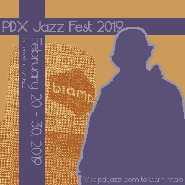
This cover was done in collaboration with Kodalev Daniel, he took the photos and i was tasked with using them in order to create a cover for the Portland Jazz festival. he wanted a colour pallette similar to the dave brubeck quartet - time out, so i used that to sample colours to use for my final project this one was done in collaboration with Mia Nelson, for this one i was able to use a colour duotone in order to make it look older, and the pallette was inspired by the 30s and 50s. i wanted to give it that old vintage look turned modern, so i used that old pallette, but the shapes and the rest was inspired more by current contemporary art.
Project #8 - Digital Alternative Process

Cyanotype is the process of making a photo by processing in iron compounds. in order to make a cyanotype photo with a digital camera, you just need an inverted photo, the chemicals, and a canvas. in order to prepare the canvas, you brush the chemicals onto it and make sure your work area is dimly lit to avoid accidental exposure to light. then you put your negative on top, and sandwich it between two pieces of glass to prevent movement. then all you need to do is expose it to UV light (such as the sun) Dagurreotype is the earliest photo processing technique known. It involves using a polished silver plate exposed to halogen fumes, which makes the plate photosensitive. to create the image, you put the plate into the holder, and remove the opaque protecting cover, which allowed the plate to develop an invisible image. in order to make it visible, you would expose it to the fumes given off by heated mercury in a specially made development box. Chlorophyll Process Th...
School Community project- Perspective of place

For this project me and my group partner (Amanda Taylor) had to take photos of a place that represented the lincoln community. we chose the shop room for the theatre, since in there it's a tradition to sign your name on the wall when you're a senior. and because of this there are names from kids all the way back to i think the seventies. using the photos we took, we then made a collage out of them by physically printing and pasting the photos.
Project #7 - multiple image techniques

This was a project for my Photography class, in it we were experimenting with ways of using multiple photos in order to make a single end product. We did photos that used HDR imaging, panoramas, and multiple exposure. I used my camera instead of my phone, so I had to do all my edits in Photoshop, this means that i took 3 photos for the panos and stitched them together using Photoshop. since i only took a couple photos and i used a small tripod, i was not able to get smooth shots, this is why the table in the last photo appears bent. for the HDR images i took 3 photos each with a different exposure length, this caused each photo to bee able to be combined to make an end photo that showed all values without anything being overexposed or underexposed. for the multiple exposures, i simply took a couple photos and overlayed them on top of a starting photo.
LHS band quarter 2 concerts

This poster was made for the quarter 2 band concerts, although this poster did not end up being used in the end, i am still really proud of it. this project taught me a lot about using text as a medium that can be used to show movement. Looking back on it i don't like the warp used on the dates, but the way i had used text warping to fit a shape i feel was really good, especially for my first time doing it.
1st semester reflection 1/23/2019

these were 5 photos from the semester that i felt were my best. Each photo showed something that i had learned and improved on. the first photo showed an understanding of rule of thirds that was used to bring an aspect of geometric shapes into an organic photo. my second photo showed how i learned to take photos that emulate other photographers. it also allowed me to take a darker and dustier looking photo that didn't emphasize anything specifically. for the third i learned a lot about editing photos in light room. it let me experiment and create an image that appears alien through only changing the colours and light. my 4th photo showed an understanding of masking in Photoshop. i created a mask that included everything but the nail, and i applied a sepia tone to the mask. the last photo showed an understanding of colour as well as emphasis on a portion of the photo. overall i feel that the thing I have improved on most this semester is both editing as well as shoot...

Project #5 - Basic PS and Camera Controls

these pictures were for my photography class where we were experimenting and learning about several types of camera controls. by this, i mean how to use manual controls to make an image look like it has blurred motion, frozen motion, shallow depth of field, or deep depth of field. in order to shoot these, i had to put my camera into manual mode, and i had to change aperature, exposure, and shutter speed. this allowed me to get the achieved look, without editing.
A time you were wrong

This project was a struggle, I'm not afraid to say that, because I spent so much time on it. I poured my free time into it, and in the end it became my first published work. this piece was created to illustrate a poem called A Time You Were Wrong, for the book Bridging The Divide by outside in. Outside In is an agency that takes in orphaned children and provides them with the opportunity of education, and escaping their past lives if they want to. their cause is honorable, and I encourage you to donate and support them if you can Outside In's Website
Map of Midab Mora

This is a map that i had made last year of a fictional world that me and my friend had created. this world is full of orcs, cat people, and elves. each island has several provinces that have their own story and culture. This was the first time i tackled something so large, and it turned out amazing.
Colours of Unity

Colours of unity by Cally Cruikshank shades of violet are used to create a sense of unity in the viewer by unifying every aspect of the design. the colours were chosen specifically to invoke peace and fear into the viewer. everything is evenly spaced and symmetrical to add a balanced yet weighted feel. portraying life's necessary balance of stress and achievement.